Behind the Shapr3D user interface refresh
.webp)
Traditionally, CAD modeling is hard. But does it have to be? Our aim is to identify and remove unnecessary complexities and make CAD fit the everyday workflow of you and your team.
Most CAD tools were born in a generation of complex interfaces with toolbar labyrinths typical of the desktop setup. By the time the mobile-first generation began, CAD had already become strongly tied to this type of user interface in its development. Much of the complexity still remaining is due to the wide range of available choices deemed as must-haves. CAD has so often meant needing to fight your way through long lists of irrelevant menus and submenus that ignore your context.
The innovations of CAD have propelled it through technology generations and paradigms, continually expanding its accessibility. Where in its beginnings CAD was used solely by CAD operators working on mainframes, SolidWorks broke barriers by bringing CAD to the personal computer in the 1990s. Now is the time to take another leap.
At Shapr3D, one of our biggest design challenges is dealing with the CAD complexities inherent in its desktop heritage. We aspire to transform status-quo CAD to make it ready for mobile evolution. Here’s how.
The challenge
Multidevice: the truly mobile experience
Born mobile-only, we grew up to be mobile-first. Now we’re ready for the next step to provide the ultimate mobile experience: multidevice. While mobile fit on-the-go needs, we found it wasn’t always practical.
The mobile transformation of the last decade brought new principles to design. Smaller screens and devices require more focus and better organization. It’s not enough anymore to cram a bunch of features into long lists of toolbars and menus. Since in the past computers didn’t understand intent and context, user interfaces were built to be reactive and not proactive. The future of CAD modeling needs to be proactive by adapting to your context and surfacing the right tools at the right moment. As Shapr3D has been evolving into a multi-platform, desktop-grade CAD tool we are faced with the challenge of maintaining our Adaptive CAD experience across platforms.
What if, instead of catering to mobile, we would let you pick the platform best suited to your task at hand? And let you change as often as you like? That would be a significant step forward from mobile-only, or even mobile-first, that would allow mobility on a meaningful level. Move between the office and shopfloor, onsite and back, multiple times a day. That’s mobility.
To devise the multi-device workflow, we sought to fuse the best of desktop and mobile.
Instead of needing to weigh device pros and cons, you should get the pros of each in one consistent, cross-platform Adaptive UI experience.
Achieving this meant setting the framework of our Adaptive UI straight. Initially, our software excelled at the earliest stage of the CAD workflow: sketching and concepting. As we cover a larger part of the workflow including 2D Drawings, Visualization, and more in the works, we need to open up more avenues that this user interface refresh covers by fine-tuning how you navigate the software.
Beyond improving the underlying structure, our most important task is to make sure that your daily workflow stays intact. You should feel just as at home after the refresh as you did before.
Throughout last year, we debated solutions. At first, every possible solution seemed redundant. So we stepped back to get a better overview of this problem space and came up with new ideas that led us to a structure to inspire this refresh.
Ways we are managing complexity
Our design goal was to introduce a refreshed layout paradigm: to build the interface around your implicit and explicit actions and not around available screen estate. We visually mark adaptive and fixed parts of the interface, so you could have anchor-like points to grab onto when you’re ready for the next action.
Easier to discover
To make sure that you never have to search for your tools, we’ve reinforced our Adaptive UI by forming new logical groups and a better hierarchy. We revisited foundations, took a look at every button, and examined their priority and importance to categorize which surfaces dynamically and which stays stationary for you to access at any time. Now turning on sync, sharing a project, or renaming a project from the editor will be possible right from the top toolbar.
Similarly, opening sidebars like the Items sidebar or the newly launched Drawing Properties sidebar will be available from two fixed sections on the top left and right corners of the Shapr3D main menu.
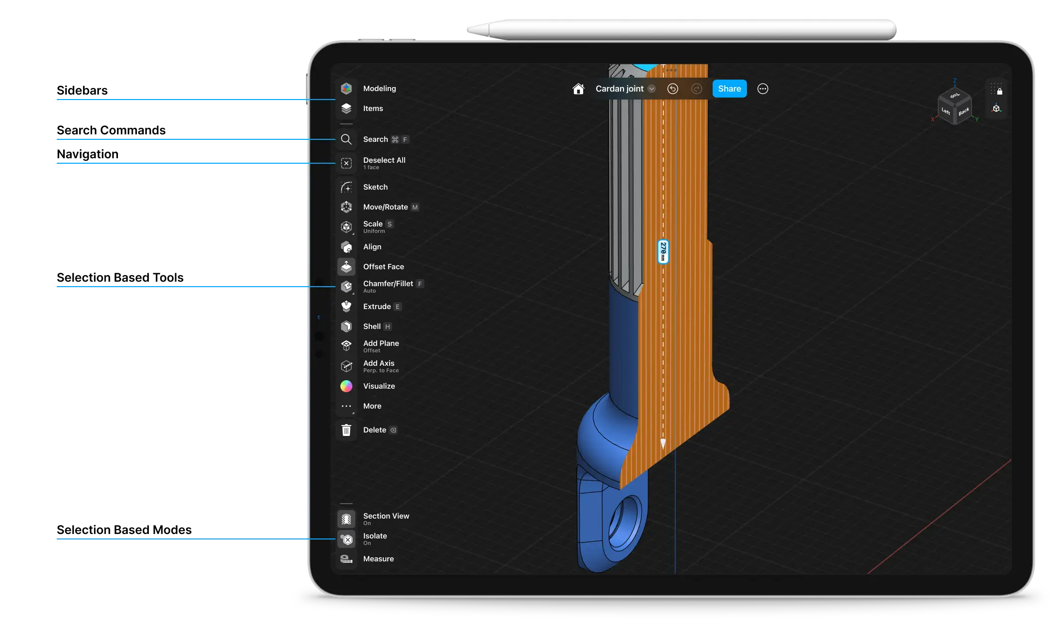
Changing units, grid snapping, or enabling zebra analysis will all stay together with the Orientation Cube to form a section for your view and model space preferences.
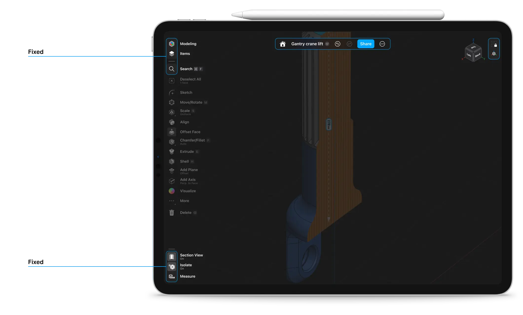
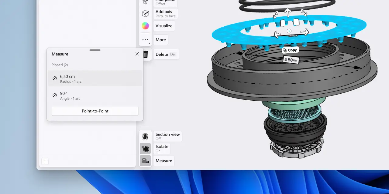
Quick-toggle mode islands
To cement our cross-platform Adaptive UI experience, we’re introducing a new section in the Shapr3D menu in the bottom left corner. Here you’ll find three modes previously scattered across the interface collected into one place.
This new fixed section in the menu will adapt to your selection and surface Section View, Isolate, and Measurements when it’s relevant. Now we’re also connecting these permanent modes to their toggle button. Whenever you want to know a mode’s status, a quick glance at the bottom left corner of the screen will show if it’s on or off. Just toggle to change the status.
Cleaner overview, consistent navigation
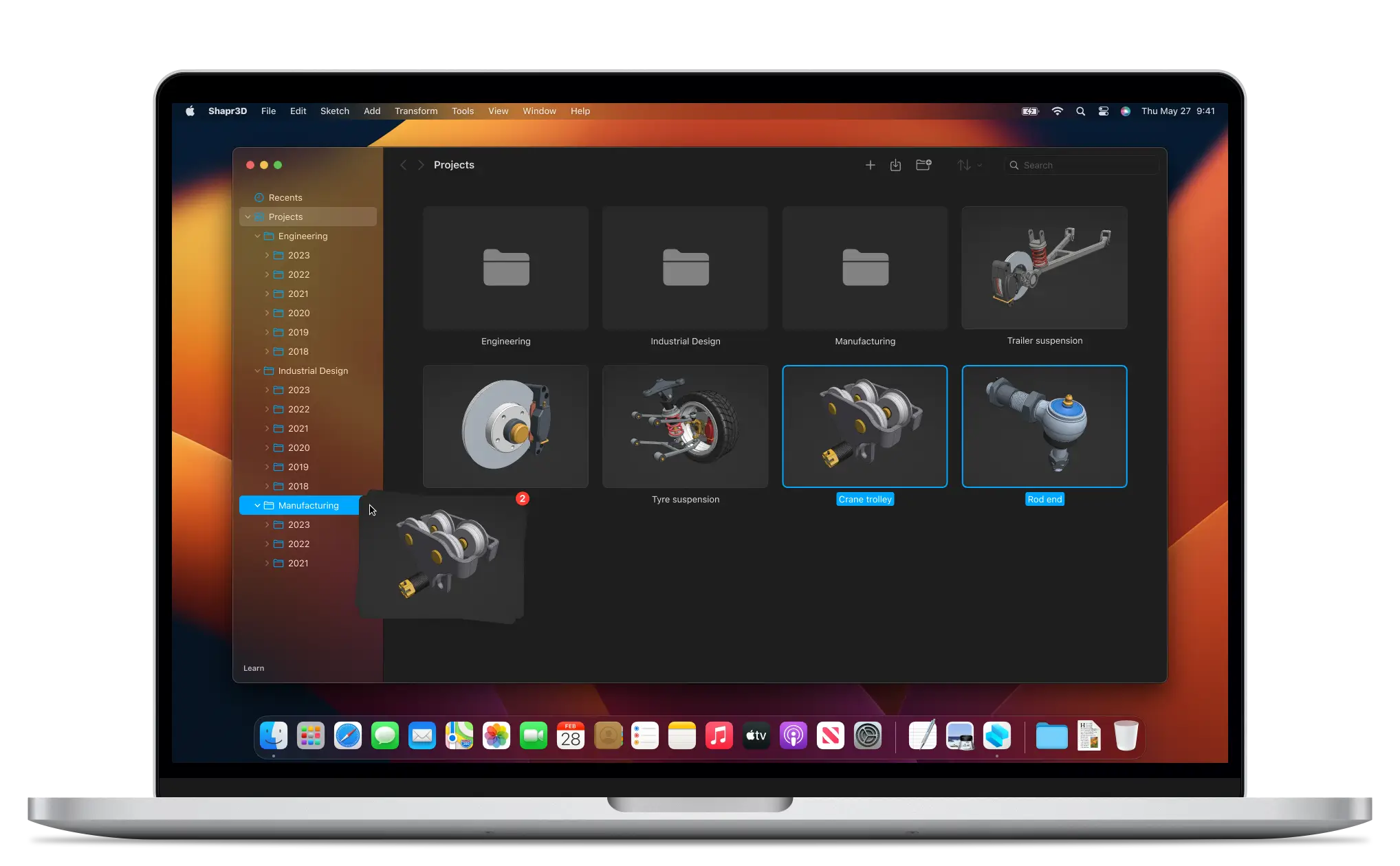
For effortless access to all key project artifacts, we’ve added quick-access navigation checkpoints. This will later allow for easier handling of document types as you add various diverse artifacts such as 2D Drawings and Visualized models to a single project.
To support a less linear, more flexible workflow and help you iterate and jump between different stages of the project, we’re introducing a new Project Sidebar. Now you can switch to a different space from anywhere inside the editor. Double tapping or clicking on the project sidebar button will quickly take you to your last visited document inside the project without you needing to reopen the sidebar.
We think of the Project Sidebar as a foundational building block to bring more professional workflows to Shapr3D. You’ll see new features showing up there in the upcoming years.
We addressed structural changes to the dashboard as well. Some of these changes to your design list are already visible to you. We’ve introduced a new sidebar navigation to the dashboard and adjusted how the design cards appear in the list. These are important not only to create a better visual hierarchy but also as forerunners for the upcoming folder functionality. Moving designs into folders will be just as easy as dragging and dropping design cards from the list onto a folder. Meanwhile, the new left sidebar will help you to organize your folder structure the way it fits your workflow.
On the surface
Of course, these behind-the-scenes changes might not grab your attention as quickly as the newly refined look and feel. Our philosophy guided this refresh: We believe that the best way to get the most out of your device is to build on native platforms. This means that Shapr3D continues using the native UI language of the three supported platforms: iPadOS, macOS, and Windows. To make you feel more at home using Shapr3D on whichever platform you choose we’ve carried out our visual refresh to come with a characteristically custom fit across platforms.
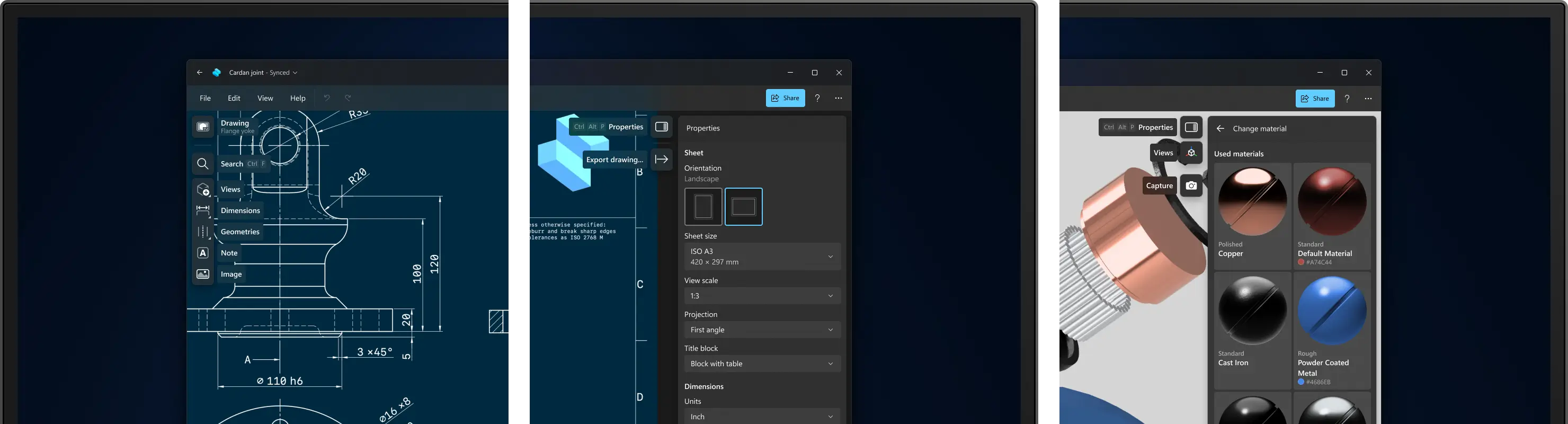
Typography and button looks were all tweaked with a single intention: improve your productivity. Labels are larger and offer better readability. Buttons are rectangular and use space more efficiently. This also means that we can fit more actions into the menu while maintaining visual clarity.
Fresh take on iconography
Our primary goal in refreshing our iconography was to create a set that better matches various sizes and platforms. By creating a consistent look, you can feel more in tune with your platform. To match comfort with functionality, we also looked at opportunities to introduce more details and better clarity. Our old icons used only a fraction of the available space inside the menu button. They had thinner lines, were smaller, and had small details that got lost in some scenarios.
The way we approached this was by keeping the same icon size and also increasing the size of the shapes and line widths inside to make them more prominent and increase the contrast.
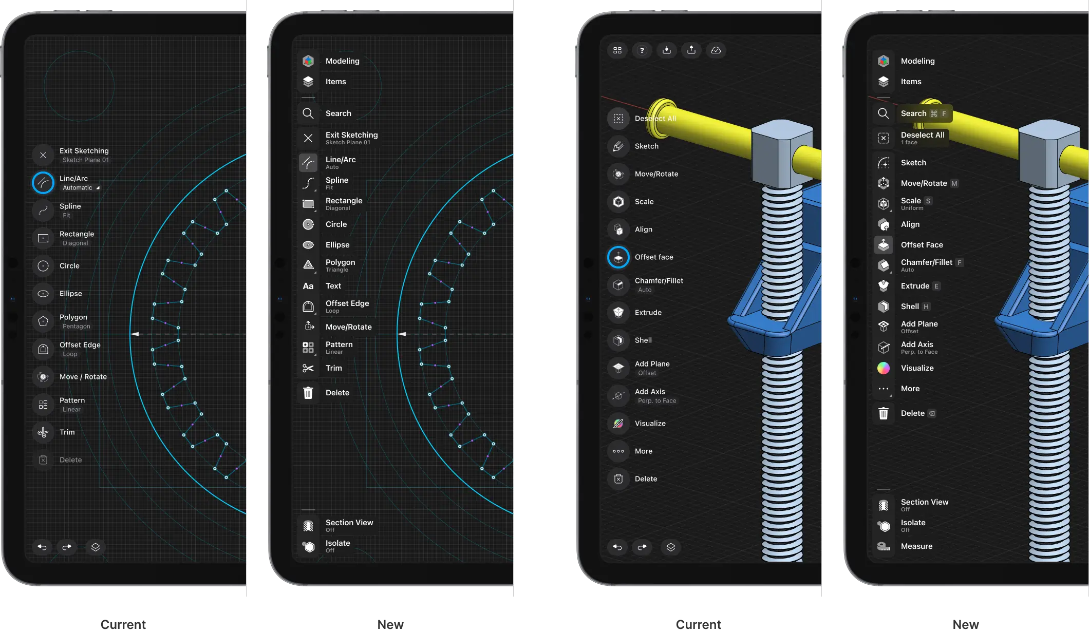
Since the vast majority of your environments are line-based, we shifted away from line-based icons to filled-shape icons. Icons with a similar visual language can create a hierarchy problem and clutter. We removed this conflict with the contrast of filled-shape icons to create visual distinction for a smoother modeling experience.

Additionally, this gave us the opportunity to align our icon set to better match the operating system you’re using. This icon set plays well with Windows 11 and Apple’s own iPadOS and macOS icon set.
What’s next
Our intention was never about completely overhauling the interface. Instead, we wanted to focus on what is already working and build on top of that. We believe that this refresh will enable us to bring a more professional workflow to each platform and maintain ease of use throughout the application. We are already underway preparing some really exciting projects that are being enabled by the foundational work this refresh has started.
Our Shapr3D user interface refresh is coming this summer. Stay tuned.