Built for more: Introducing the upgraded Shapr3D brand

Nearly a decade ago, we set out to break down CAD barriers, to leverage its power while building upon its versatility. In short, to evolve it. Our journey has been marked by pivotal product developments. This culminated this past year in a series of product launches. From the visual refresh, to the 2D Drawings overhaul, and, finally, History-Based Parametric Modeling Beta, our roadmap is a culmination of countless small improvements we’ve made along the way.
In the process, we evolved as well. Our look and feel became outdated, no longer reflecting who we were becoming. This became the force behind the rollout of our new brand identity: to better reflect how far we’ve come and how far we still intend to go.
A Shapr3D X Koto collaboration
Ultimately, our decision to upgrade our brand led us to turn to Berlin-based design studio, Koto, for their world-class expertise. What followed was a multi-step process in which the Koto team fully immersed themselves in the culture of Shapr3D, our goals, and the CAD industry as a whole.
Together we constructed a strategy through which the Koto team grounded our vision in a comprehensive identity. To start, we discussed our story up until this point and the core philosophies that drive us forward. Here’s the unfolding of what we uncovered with these conversations.
Harnessing complexity: the ideology behind the update
As humankind innovates ever greater things, there is an ever greater need for sophisticated tools that make complex tasks simple. So we took a new approach to CAD that puts 3D design in the hands of the designers and manufacturers in charge of driving innovation and leverages everyone’s expertise. So that mastery is more translatable, able to readily take form in a 3D design tool that makes the requirement to master the tool itself obsolete.
Free to move about away from desktop, free to innovate at the pace of imagination: 3D design redefined enables cross-team collaboration and compatibility across devices for more efficient, frictionless workflows everywhere. With a modern-day tool for unleashing human ingenuity, we can collectively build a better world around us.
This underlying perspective is manifested in the elements we selected to make up our upgraded brand identity. Each element better links us to the physical world and the design and manufacturing space we serve. We believe that ideas are not just lofty concepts floating in the ether but goals that require pursuit and dedication to achieve. Ideas are meant for manufacturing.

Rooted in the “S”
While we loved our original logo, we wanted to make it more manufacturable. Our new logo pays homage to our roots while taking on more flexibility. This consists of three components.
Our new logo is grounded in the same footprint of the original, maintaining the same general structure. While we have evolved, at our core we have always driven toward the same goal: to make CAD accessible and to give you a frictionless experience in every aspect of your workflow. Nothing should stand in the way of you realizing your idea.
For this, you need to move freely, untethered to physical limitations in order to form and build with maximum focus. This brings into play the second component of our logo: the creative space. You work in this space within the Shapr3D user interface and you bring your creativity into the physical space around you. Wherever you go, your space is yours to own and shape.
Lastly, we wanted to build upon the same signature “S” of Shapr3D found in our former logo. This aspect of our logo is subtle yet gives it a robust feel.


Colors of the vibrant real-world
Our team at Shapr3D was very passionate about keeping the color blue integral to our brand, but dialed up the vibrancy to help make it more functional.
For the rest of our color palette, we wanted to add more physically grounded secondary colors of light blue, yellow, peach and green. Together the palette helps us merge the digital with the everyday real world.

Creativity sparks a technical typeface
After much deliberation, we landed on Fraktion Sans and Fraktion Mono as our new typefaces. Both have a more industrial, technical feel. With a heritage of physical signage and fine details such as ink traps harkening back to letterpress physical printing, they are rooted in the real world. The letters lend a sense of clarity while maintaining a surprising sense of playfulness. Rigor meets creativity, much like the process of giving your all to your best design.


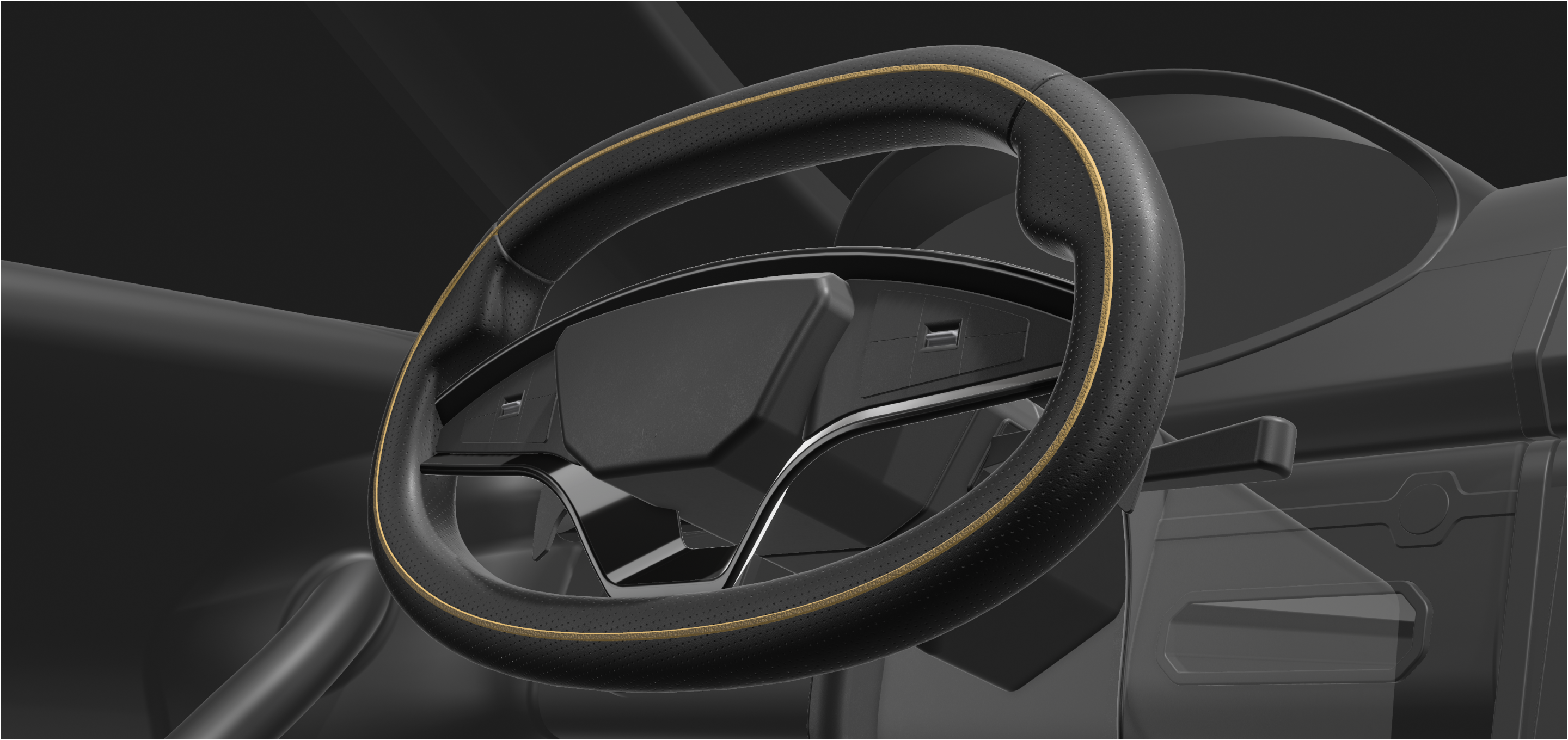
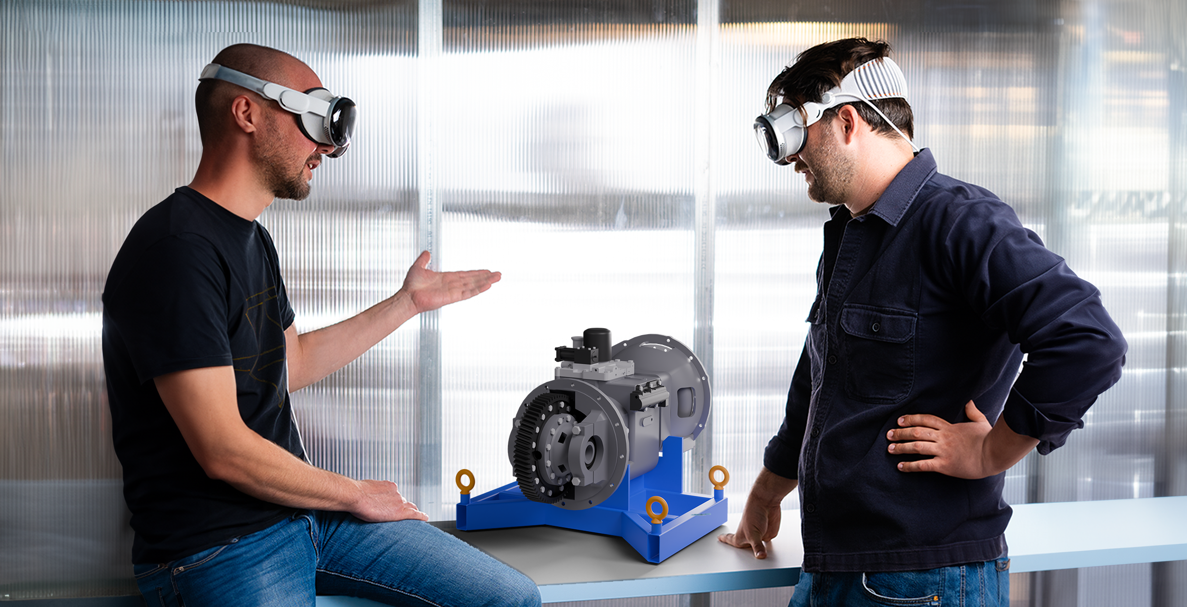
A visual reflection of our users
Much of the guidance behind our roadmap has been the voice of our users. Our new brand will utilize imagery that continues to put our users and their designs front and center. Each idea created in Shapr3D takes on tangible form as they’re put into production. This includes 3D models created in Shapr3D, 2D projections of those designs, visualized parts, and shots of our users within their working environment.
More human photos come coupled with a layout system characterized by a flexible layout grid. Easy navigation is key to providing a clean space for functional use. These are reminiscent of the data sheets commonly found on technical documentation, and also harken back to Shapr3D’s strength of harnessing and breaking down complexity.

The map ahead
We’re excited to roll out brand updates that better speak to our continued aim: to make 3D design serve the entirety of your design and manufacturing workflows. Over the next few months, you’ll start to see the visual upgrades across our platforms. You can explore our website and social channels to get a glimpse of our updated colors, typeface, images, and more. Welcome to the updated Shapr3D brand – built for more.